

. NEWSLETTER DESIGN IS THEFT .
Every great designer gets asked the question:
“Where do you get your ideas from?”
The honest designer answers:
“I steal them.”
Nothing is original.
With practice, we add our own soul into the mix.
The perception of originality is always different than the facts.
A SIMPLE WAY TO STAND OUT
Extract inspiration outside the newsletter field.
Don’t copy Morning Brew’s newsletter design.
Too many are doing it already.
Don’t copy Big Desk Energy’s newsletter design.
The inspiration for it didn’t come from another newsletter.
Don’t copy Milk Road’s design—it is not worth the trouble.
INSTEAD, REVERSE ENGINEER:
their subscription flow
their unsubscribe process (if any)
their newsletter structure
how they position sponsors
how they sell products and services
what’s happening behind the scenes?
BEYOND NEWSLETTERS
Where do we get our newsletter design inspiration?
From sources such as:
Other live websites that resonate with our brand’s vision
Futuristic, modern, or retro platforms like Windows OS, Mac OS, or AOL
Nature, architecture, and my wild imagination
The UI of any social media platforms
The UI of cool software platforms or mobile apps
Sports brands (old and new school)
A combination of any of the above
The entire web (and offline world) is your oyster.
Ideally, you want to have a theme-style in mind.
Don’t be lazy. Have a vision—even if it is not 100% clear.
Otherwise, you’ll be at the mercy of my creative taste. 👾

FYI
Pixels newsletter design tips are based on your questions. Don’t be shy now.👇

Here are two instances where I drew inspiration from a website's design or a platform's user interface to create newsletter sections or components:
Example 1

I designed it all on Canva from scratch but I do not recommend long vertical images for the top section of a newsletter, unless it is part of your vision.

Example 2

For example:
Dotted background on the images and section headings
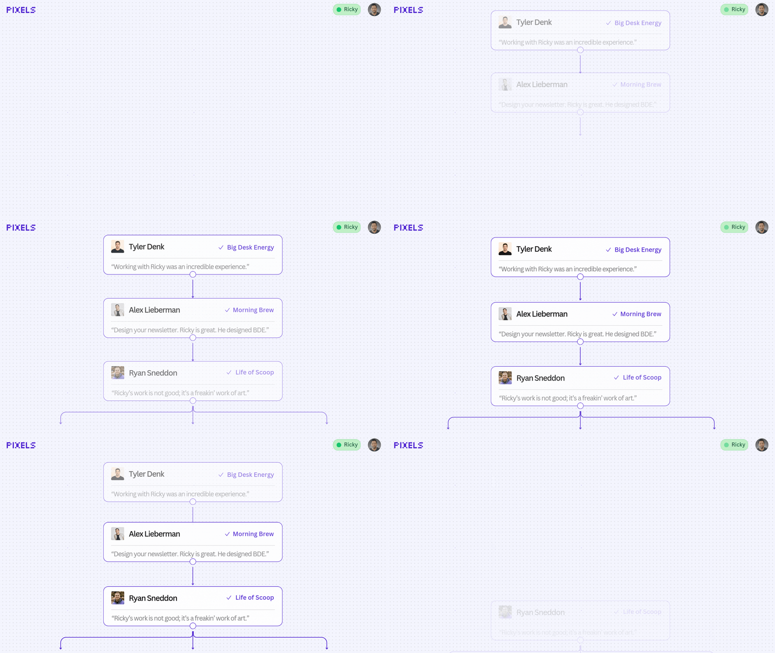
Testimonial image at the bottom of this email
All of it, designed on Canva.

Skill up with our video tutorials, guides, or playbooks:
Newsletter breakdown: Check it out on beehiiv, X thread, or LinkedIn carousel format
.FYI.
Many of the tools, tutorials, and guides you’ll see here, will be created or added based on YOUR questions. So, don’t be shy now. 👇
👾 Beehiiv Design Services — let the Pixels newsletter design pros transform your newsletter brand. [View packages & pricing]
👾 New here? Join the newsletter [it’s free].
That’s all for now.
Want to share this edition of Pixels via text, social media, or email?
Just copy and paste this link:
Until next week!
Get creative,
Ricky 👾
🇺🇸 Joe Portsmouth: An absolute magician. His work exceeded my expectations.
🇺🇸 Sam Woods: One of the most talented newsletter designers I’ve seen!
🇺🇸 Michael Galvan: I highly recommend Ricky and his team at Pixels!
🇬🇧 Matt Navarra: Ricky delivered a slick redesign that my audience loves.
🇺🇸 Mike Vernon: The go-to newsletter design expert! 🐐
🇺🇸 Michael Boorman: Ricky designed my newsletter better than I could imagined.
🇺🇸 Talia Bender Small: Ricky ensured the design and overall newsletter was perfect.
🇺🇸 Justin Swarz: Ricky goes above and beyond. Phenomenal designer!
🇺🇸 Jordan Mix: The best in the game.
🇺🇸 Morgan Barrett: Ricky is the goat.


