. GAME TIME .
Hey, it’s Ricky. Welcome to Pixels’ 1st edition (finally!)
Live from Florida. Fired up, filled with passionate gratitude, and a bit pissed off at myself (good!) but that’s a story for my other newsletter.
I decided to split Pixels (at 2am) into two editions per week.
👾 Break It Down Edition
→ newsletter breakdown (pixels style)
👾 1-2-3 Edition
→ newsletter design tips, how-to edition
That brings up a question for you that I’ll ask at the end of today’s breakdown, so turn it up and watch me break it down for you.🕺
. BREAKDOWN .
. Big Desk Energy .
Newsletter by Tyler Denk
Check it out at Big Desk Energy
Designed by Pixels
Built with Beehiiv
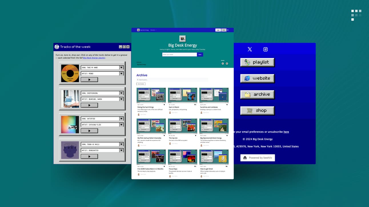
When Tyler told me that he wanted a newsletter design inspired by the retro vibes from Windows 98, I knew it was going to be a fun and unique project.
You don’t achieve this type of unique design by following best practices.
You achieve it by pushing the boundaries of what you think is or isn’t possible within the constraints of any given platform and your imagination.

Tools I used to build and design BDE:
👾 Beehiiv.com
👾 Canva.com
. Top Header Image .
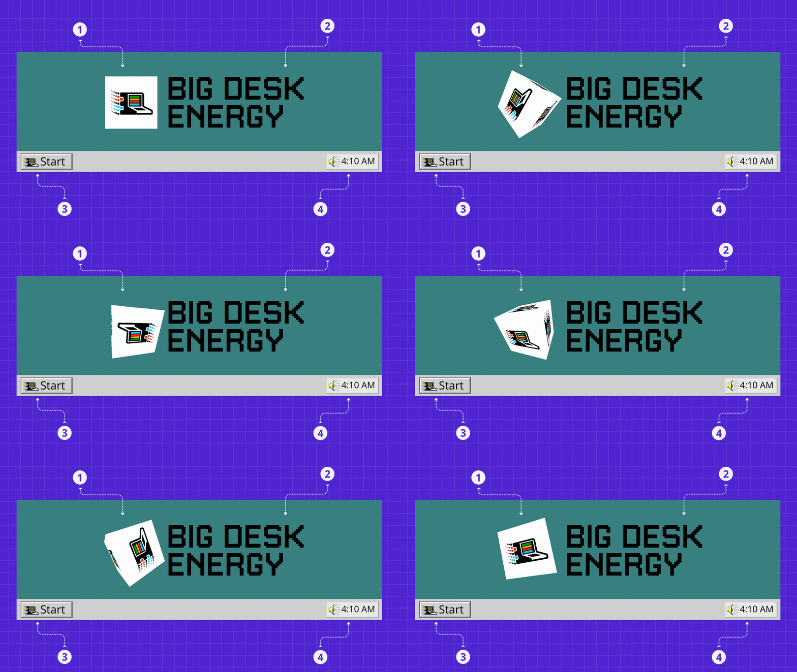
Make a statement from the start:
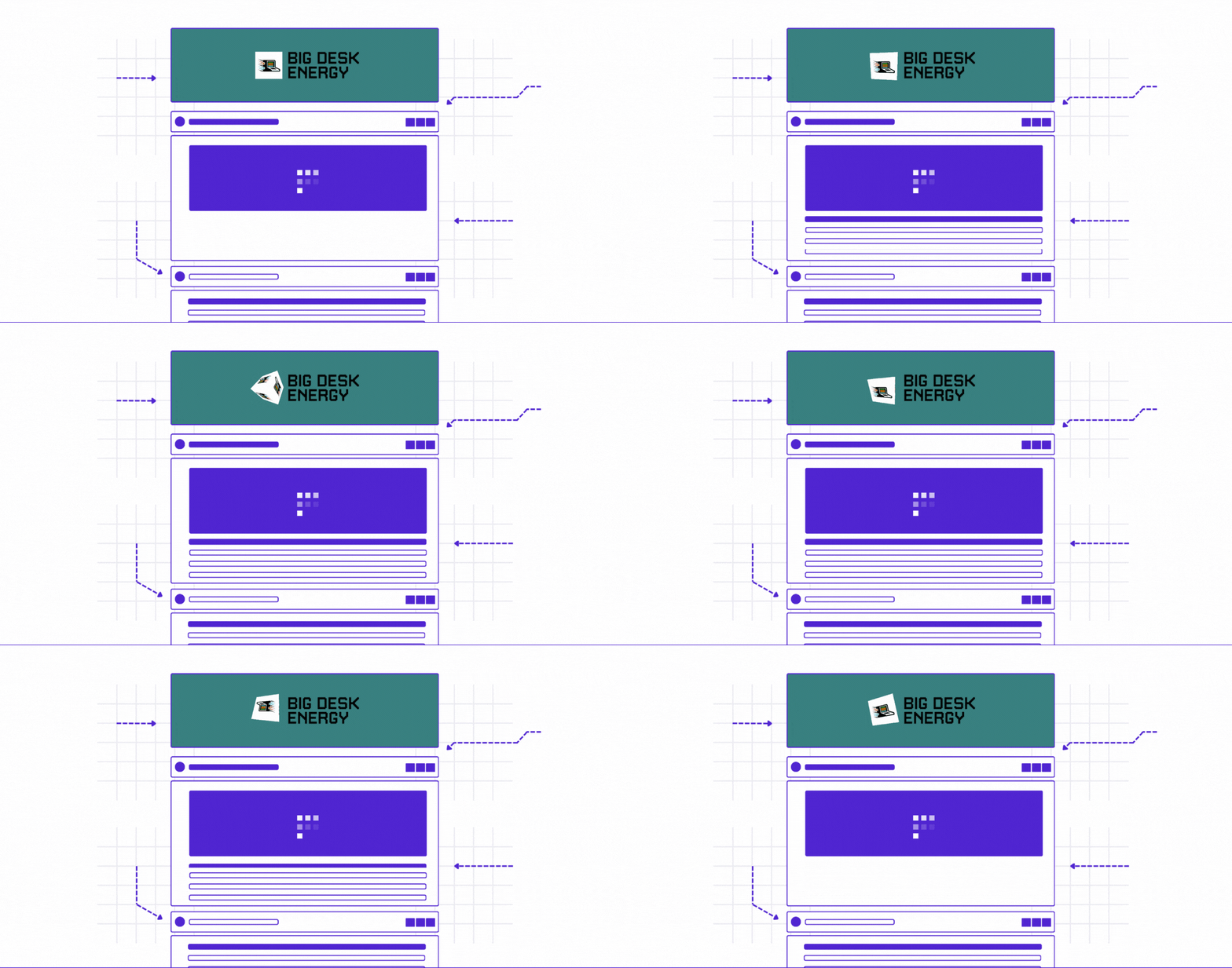
Transform a static 2D logo into an animated 3D version of it.
Use a font type that aligns with the overall design theme (retro).
Click the start button, it’ll take you to BDE’s official website.
Probably, the time Tyler wakes up daily and likes to flex about.
. Quick Note .
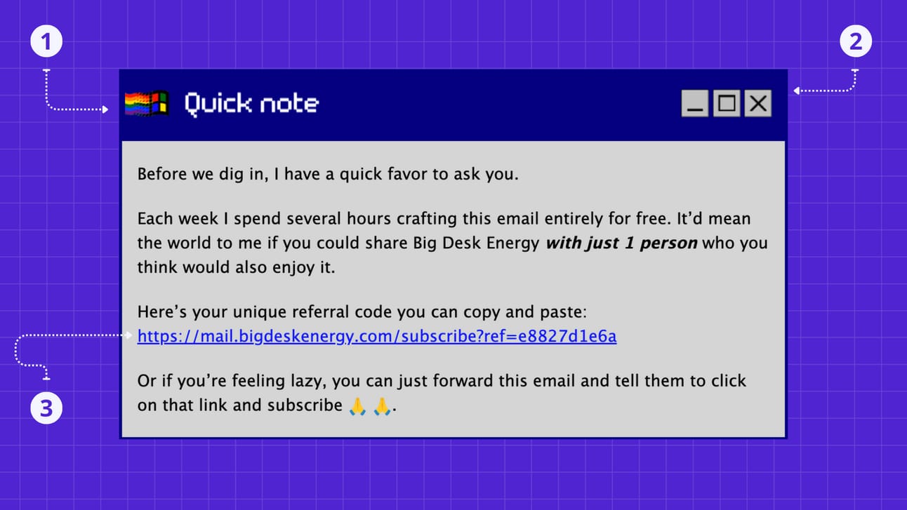
Don’t be afraid to be direct and ask for a favor:
Create custom headings for each section (created in canva).
Add one or more (on-brand) icons (left/right sides of heading).
Make it easy for readers to do what you ask of them.
His newsletter is delivered once a week but this quick note section is shared once a month (not in every issue).
. Dogfooding .
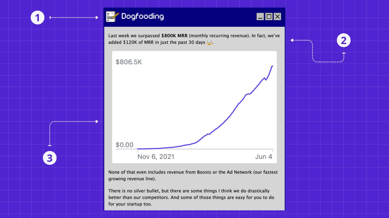
Combine experience with insights in a story-driven format:
Have an ever changing topic of the day/week to share.
Open with a story-driven fact (a good or bad result).
Support it with a visual that tells the same story. (hook them up)
End of this section:
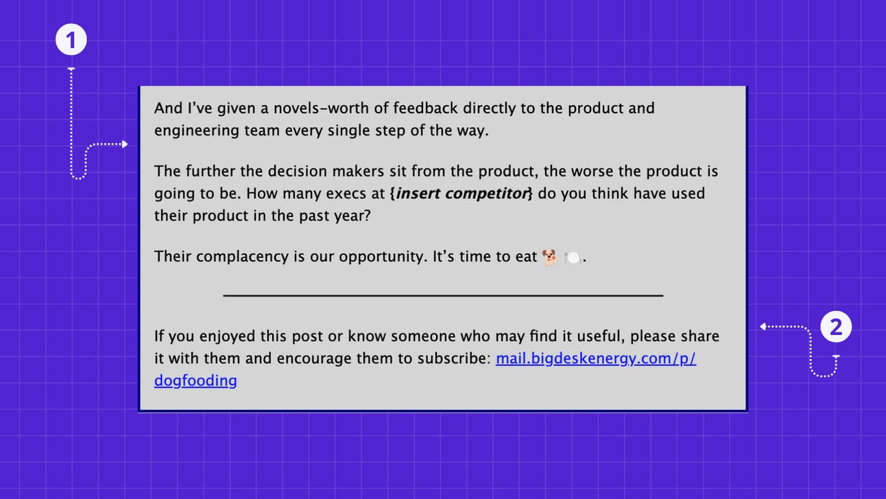
Bring it home:
End the story with a closing statement, bringing it full circle.
Add a reminder (at the end) for readers to share the newsletter.
Tyler is an excellent storyteller. He has experienced the ups and downs of doing the actual work, making his stories authentic and compelling.
No ChatGPT needed. Lead by example.
. AI Desk Energy .
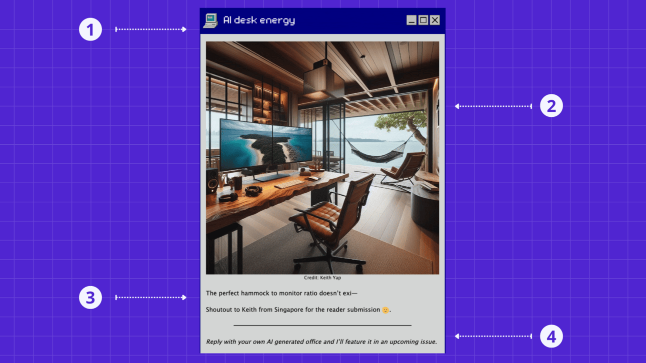
Make them part of the creation process:
Use a relevant icon to convey the section’s topic.
Use beehiiv or Canva to create an on-topic AI-generated image.
Share a quick opinionated comment about the image.
Ask your readers to submit an image for a chance to get featured.
. Tracks of the Week .
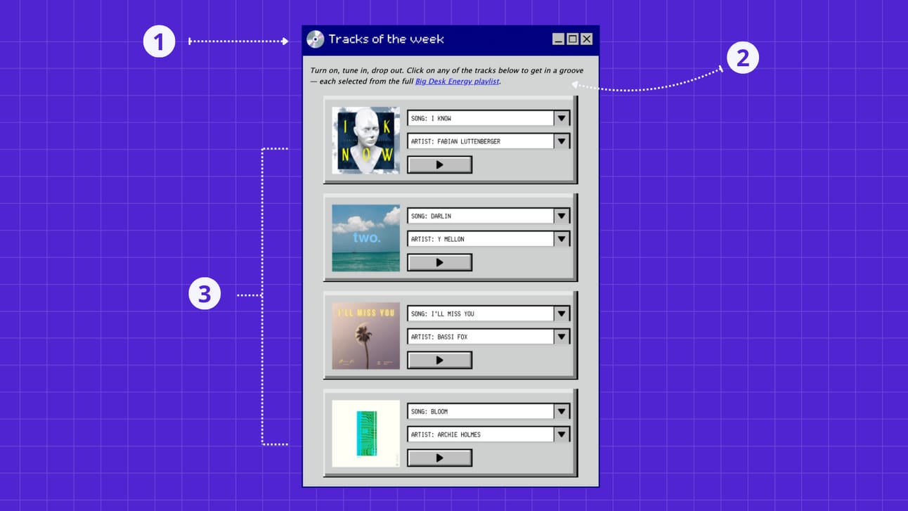
Double-down with on-brand creativity:
Animated rotating CD icon conveying section’s topic.
Provide a quick description that supports the section’s goal.
Custom images that stop mindless scrolling.
I created these images on Canva from scratch. The key here was to make it extremely easy for Tyler to edit them quickly each week.
Drag-and-drop a new album cover image that will automatically fit in the box.
Quickly change the song’s title and artist’s name.
Upload to beehiiv and add a link to it.
Imagine the alternative: just links 🥱
The tracks of the week section will inspire higher engagement, and most importantly, new vibes via the Big Desk Energy spotify playlist.
. Surfing the Web .
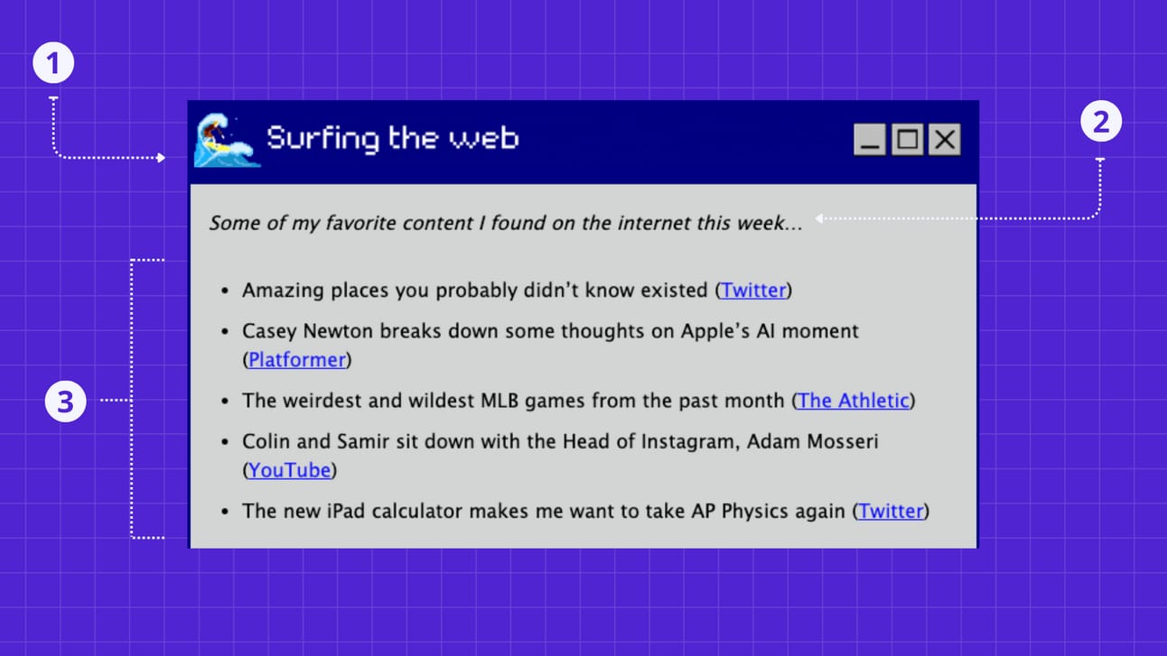
Curate (filter) what you consume:
Pixelated ‘surfer dude’ in motion conveys section’s topic.
Describe section with one quick sentence.
Share 3-5 pieces of content you enjoyed.
The animated surfer guy was tricky to make.
Tyler: “Make it look bad in a good way.”
Me to myself: “What does that even mean?”
Me to Tyler: “No worries, I got you.” 🏄♂️
Tyler to me: “You’re a legend.”
Me: “Phew…” 😅
. Referral Program .
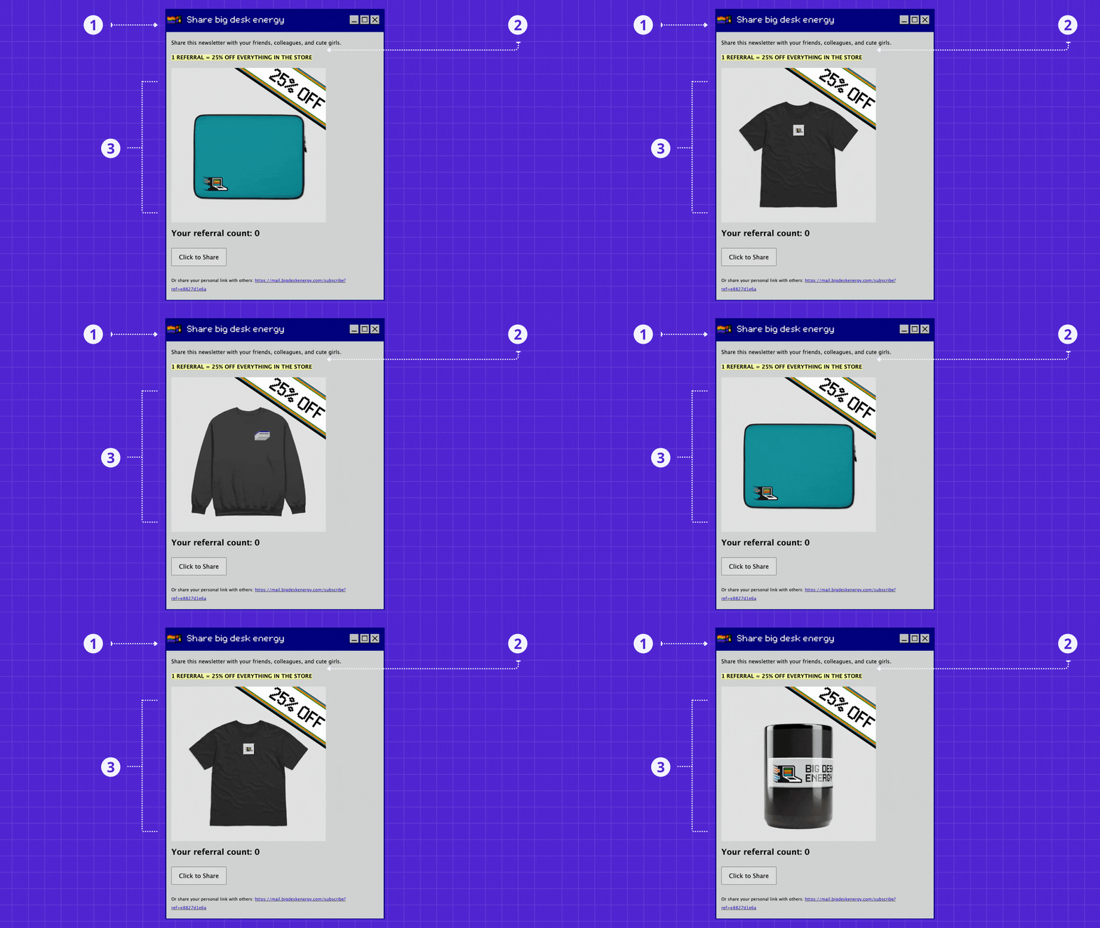
Keep it simple, sneaky, and engaging:
Keep the heading consistent across every section.
Tyler is single, so he ask you to share it with cute girls.
Add engaging gif showcasing what they could get.
The simple but brilliant moves here:
Offer one thing; a 25% discount in exchange for 1 referral.
Readers share BDE with others and BDE grows faster.
They get the discount code to buy from his store.
Hello, new merch sales. 🤑
The unspoken open loop that the reader must close:
I want (25% off) therefore I share BDE to get it. (open loop)
Once I get it, I must use it, which means I must buy. (close loop)
. Suggestion Box .
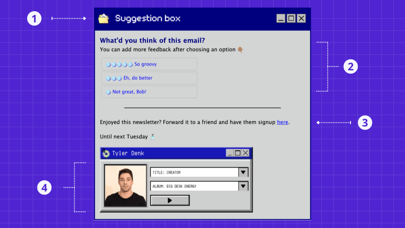
Let them give you a piece of their mind:
Subtle in-and-out icon animation conveying section’s topic.
Gather feedback from readers to improve over time.
Final yet subtle call to action: share newsletter.
Unique, on-brand sign off leading to his linktree page.
Instead of sharing a bunch of different links at the end of the newsletter, you can keep it tight and clean by linking to one place that hosts all of your (important) links.
. Footer .
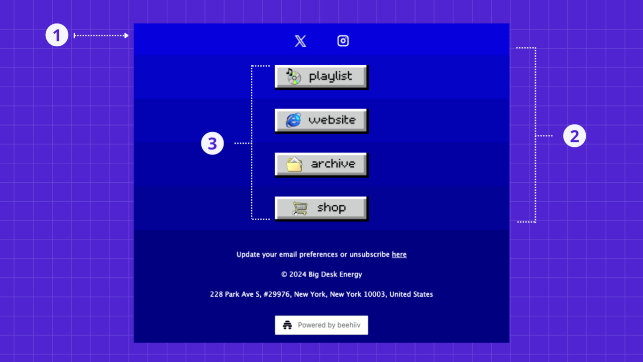
Make your important links more obvious:
Lighter section of the footer sharing main social icons.
Stacked up multiple-layer color effect (blue).
Custom retro buttons created with Canva.
Simple, clean, obvious, and on-brand.
If you liked this breakdown and think it could be helpful for someone you know, share it with them and tell them to subscribe: readpixels.beehiiv.com/p/big-desk-energy-breakdown-tyler-denk
👾 Want Pixels to design your newsletter? — we’ll transform your newsletter design, strategic structure, and results. [Book a call with me]
👾 New here? Join the newsletter [it’s free].
That’s all for now.
Want to share this edition of Pixels via text, social media, or email?
Just copy and paste this link:
readpixels.beehiiv.com/p/big-desk-energy-breakdown-tyler-denk
Q: Do you have a question/need related to newsletter design, beehiiv, or other things newsletter that you’d like me to cover here? Reply to this email, and let me know. 🙂
See you on Thursday for the 1-2-3 (show don’t just tell) edition.
Get creative,
Ricky
🇺🇸 Joe Portsmouth: An absolute magician. His work exceeded my expectations.
🇺🇸 Sam Woods: One of the most talented newsletter designers I’ve seen!
🇺🇸 Michael Galvan: I highly recommend Ricky and his team at Pixels!
🇬🇧 Matt Navarra: Ricky delivered a slick redesign that my audience loves.
🇺🇸 Mike Vernon: The go-to newsletter design expert! 🐐
🇺🇸 Michael Boorman: Ricky designed my newsletter better than I could imagined.
🇺🇸 Talia Bender Small: Ricky ensured the design and overall newsletter was perfect.
🇺🇸 Justin Swarz: Ricky goes above and beyond. Phenomenal designer!
🇺🇸 Jordan Mix: The best in the game.
🇺🇸 Morgan Barrett: Ricky is the goat.

